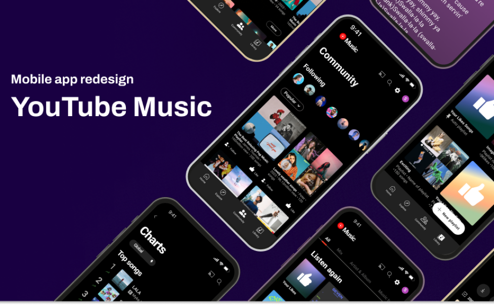
PROJECT OVERVIEW
This redesign project not only aims to address these fundamental shortcomings but also focuses on attracting non-subscribers to YouTube Premium. We have restructured existing functions and introduced key features to improve overall usability.
Team
Eden Lee
Suwon Yu
Duration
6weeks
Role
Research
UX/UI Development
Prototyping
Tools
Figma
Notion
Google spreadsheet
Miro
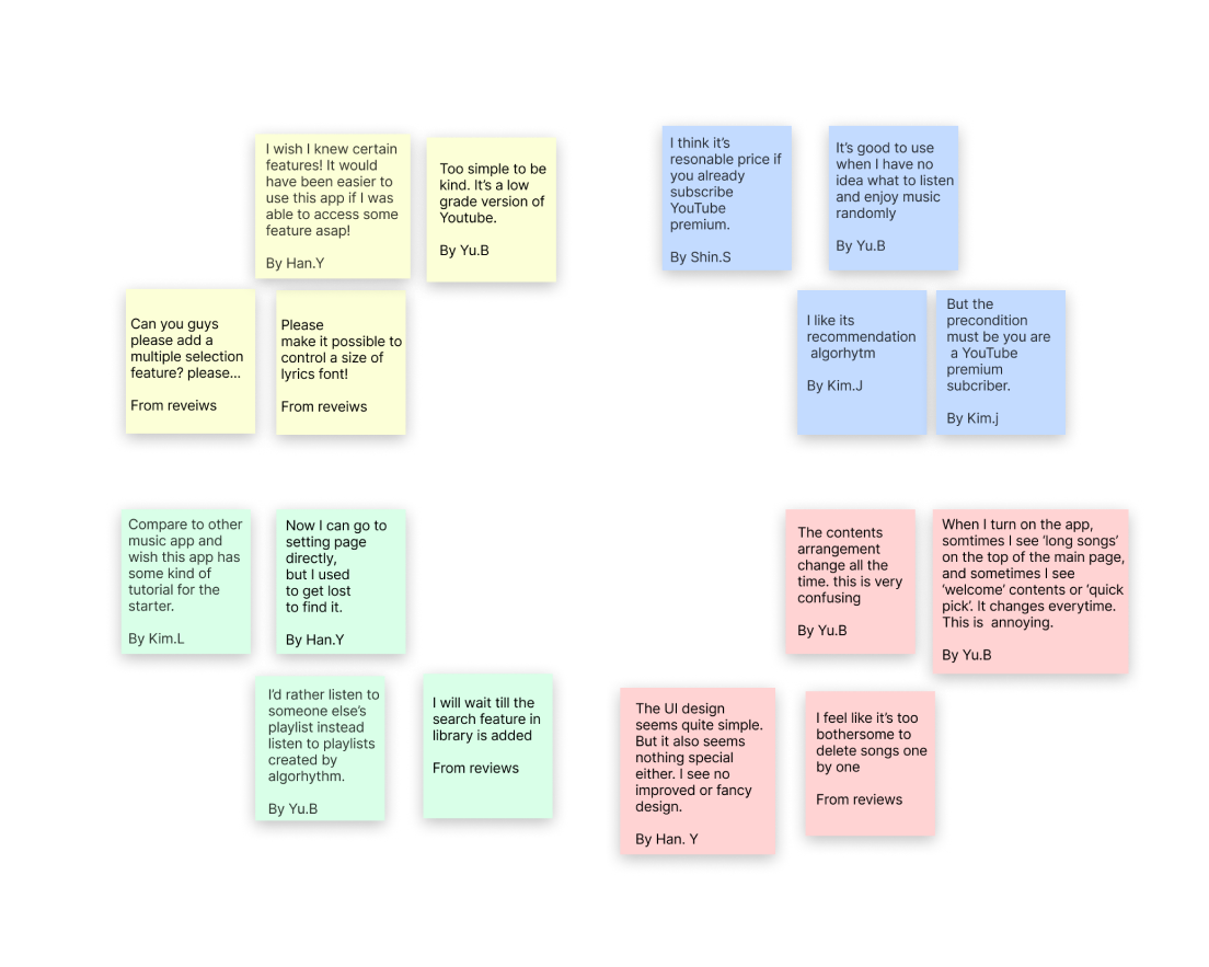
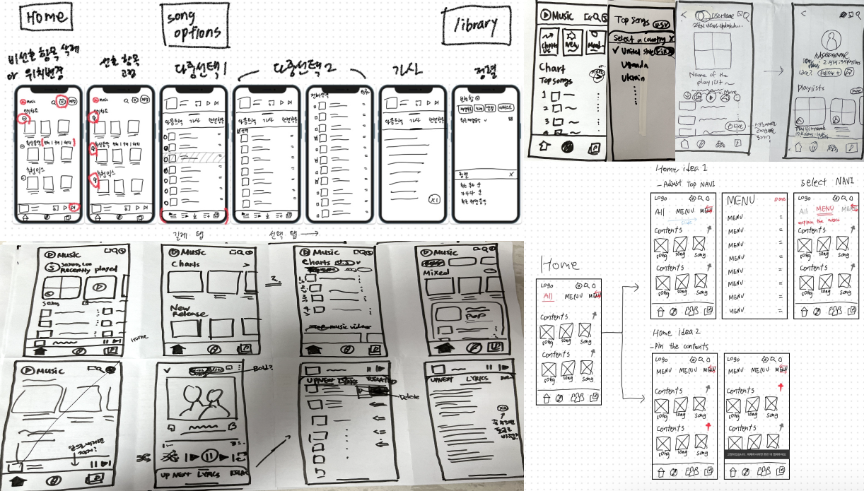
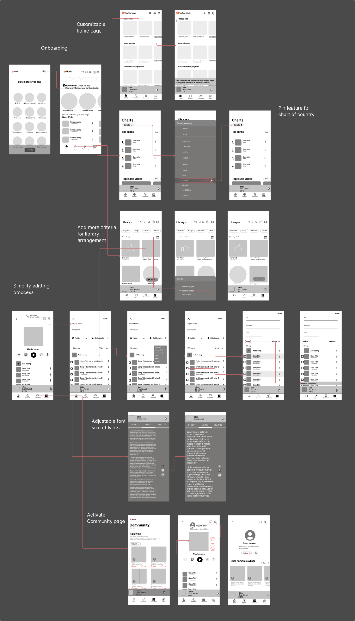
1. Problem
Confusing information arrangement
The arrangement of information is confusing, making it difficult for users to navigate.
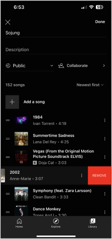
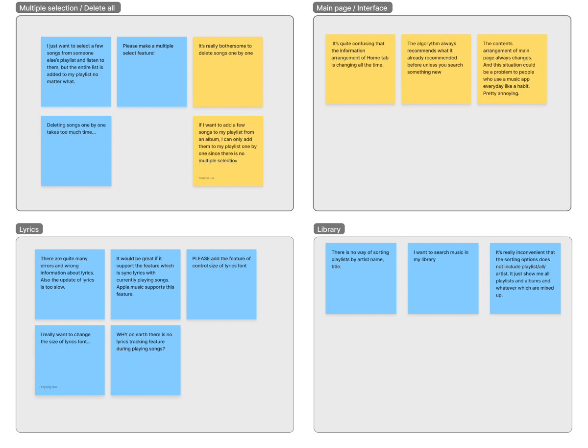
Limited Editing Capabilities
There's a lack of editing capabilities, including the ability to select multiple items at once.
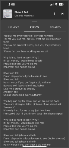
Accessibility Issues Related to Lyrics
The app does not support way to adjust the font size of lyrics which poses accessibility concerns.
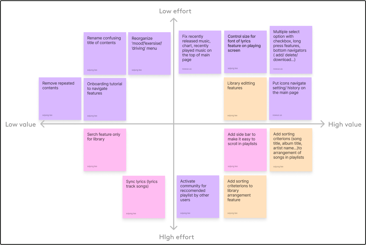
2. Solution
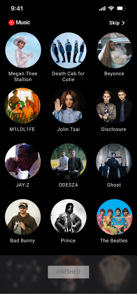
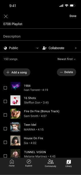
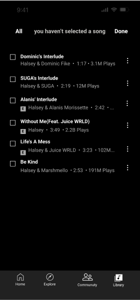
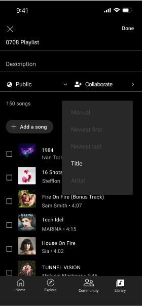
Introduction of Multiple Selection Option for Playlists
We have introduced a multiple selection option to streamline the process of editing playlists. This enhancement simplifies the user experience for both listening to music and making edits.

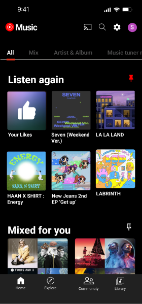
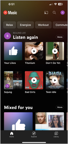
Customizable Home screen
This feature minimizes the need for extensive scrolling and provides users with the flexibility to rearrange the main page's content according to their preferences and interests.
Additionally, we've restructured the content categories above to ensure that information is more readily accessible, improving clarity and ease of use
Additionally, we've restructured the content categories above to ensure that information is more readily accessible, improving clarity and ease of use
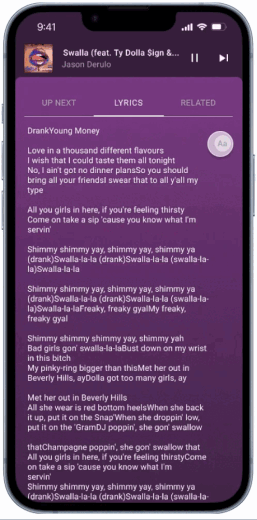
Support for Adjustable Lyrics Font Size
In our commitment to improve accessibility for viewing lyrics,
we have implemented a feature that allows users to adjust the font size of lyrics.
A simple tap leads to the adjustment feature, making it highly intuitive and user-friendly..
we have implemented a feature that allows users to adjust the font size of lyrics.
A simple tap leads to the adjustment feature, making it highly intuitive and user-friendly..
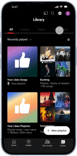
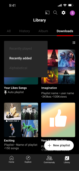
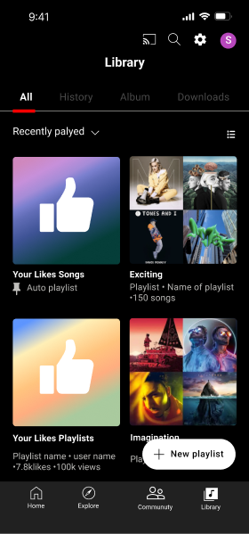
Library Structure Renovation for Improved Information Visibility
Previously, users encountered confusion while attempting to locate the 'download' tab due to its absence from the original interface.This led to user frustration and misunderstandings. In response,
we have revamped the library structure to enhance user experience.
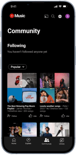
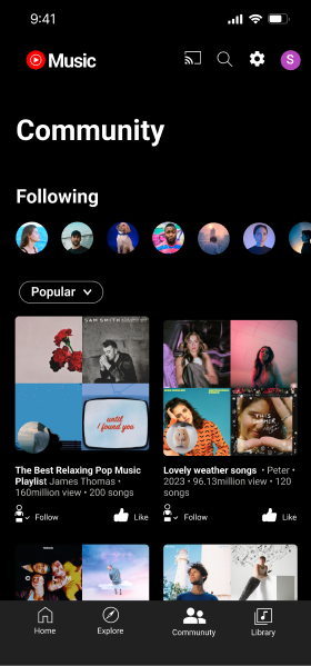
Introduction of 'Community' Page for Enhanced User Experience
In our ongoing efforts to enhance user enjoyment, we have introduced a 'Community' page, strategically placed in the bottom navigation.
This innovative feature leverages YouTube Music's existing capabilities, known as 'From the Community,' which showcases user-generated playlists.
This innovative feature leverages YouTube Music's existing capabilities, known as 'From the Community,' which showcases user-generated playlists.